If you want to read more about the ongoing development of Software Inc., you can check the official twitter account, or follow the updates on the official forum, Reddit or Steam.
All posts by Khornel
Outlines (Includes shader)
Shader download link. Read at the end of the post for instructions.
 The visual highlighting system has been an ongoing challenge throughout the development of Software Inc. It seems very simple on the surface, and in the end it was, but I had to read up on shaders to finally land on a working solution.
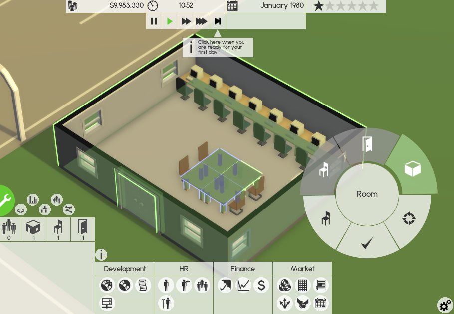
The main problem was showing highlighted objects through other objects. Initially I used a modified version of the cartoon outline shader that comes with the Unity standard image effects asset. It doesn’t show through objects, but it creates a nice outline by offsetting vertices out from their normals and using front face culling. This has discontinuity problems with flat faces, since the edges will break off when offset, but it’s not really that noticeable.
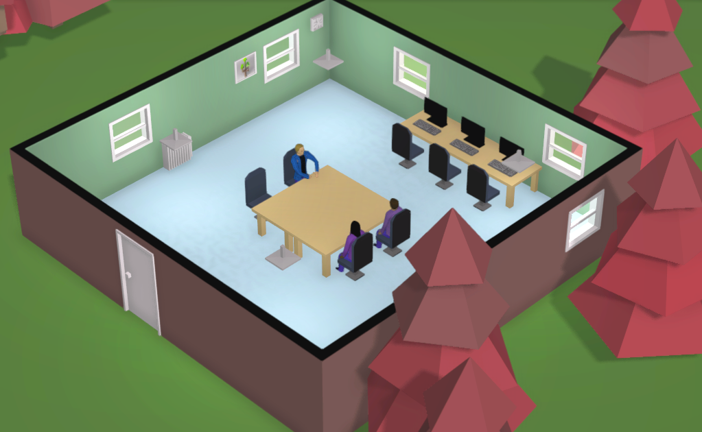
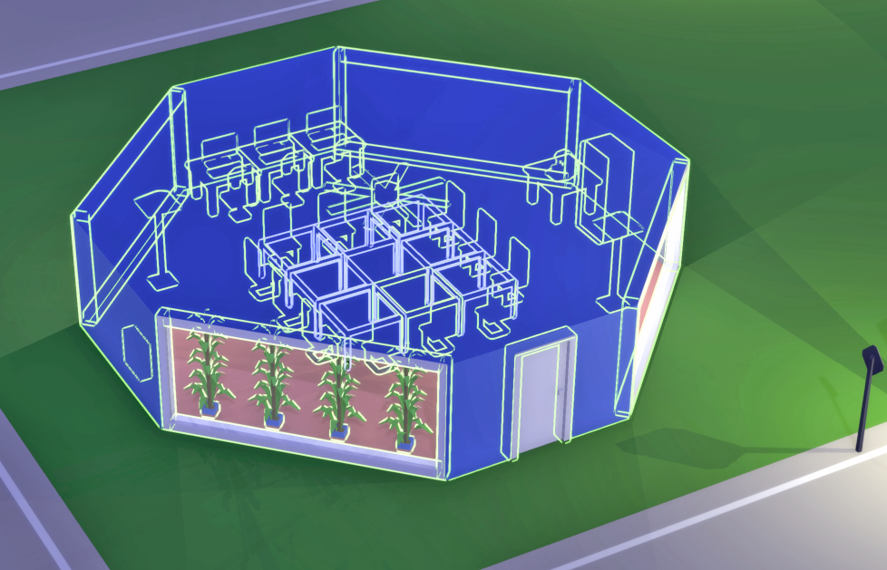
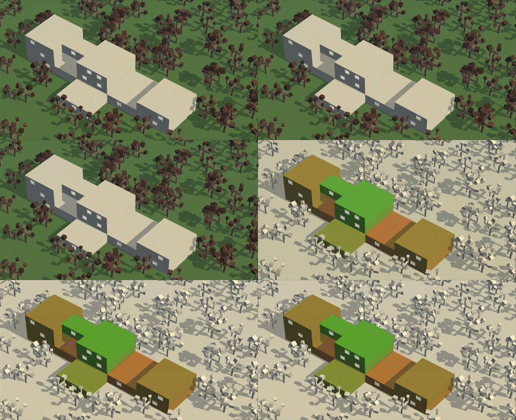
In alpha 6, I decided that selected objects needed to be visible, because I often found myself confused by what furniture I had selected, when I changed floor. I went with the easy solution of just rendering the same mesh at half opacity with depth testing set to greater, so it only renders when something is in front of it. All in the same shader as the outline. However, it still looks confusing as you can see below. You can see how the floor of the room renders green through the tables.
The final solution required using the stencil buffer, which I hadn’t used before. I couldn’t easily draw the outline on top of everything otherwise, since it would require only depth testing each object with itself. Basically you render the entire mesh including outline to the stencil buffer, without actually drawing anything on screen. Then you remove the mesh itself from the stencil buffer by rendering only the mesh. Finally, you render the result of the two stencil passes without depth testing, so it appears above everything else. This is done per mesh, so they are drawn independently of each other, meaning there is no over-shadowing and no post processing involved, like blurring to increase the outline width.
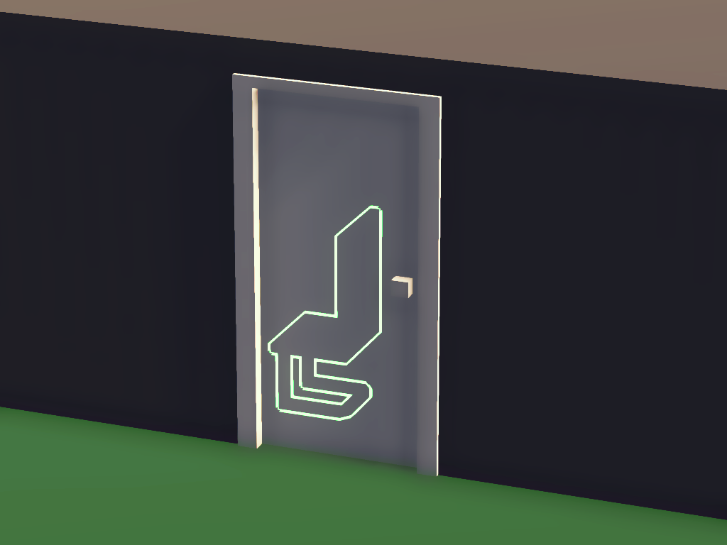
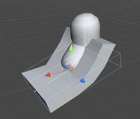
Actually putting it to use is a whole other story, but basically each mesh I want to highlight has a highlight tag and when it is highlighted an extra shared material get’s added to its MeshRenderer, which uses the outline shader. Each object which can be highlighted inherits from a Selectable class, which in turn inherits from GameObject. A SelectorController class keeps track of highlighted Selectables and tells them if they need to traverse their transform hierarchies to add the highlight material to the highlight tagged meshes.
So to use the shader, simply add a material with the shader to the MeshRenderer of the object you want to highlight, on top of the material(s) it already uses.
IndieDB
To avoid having to post the same update on multiple pages, future non-technical/non-business related blog entries will be posted on IndieDB: http://www.indiedb.com/games/software-inc
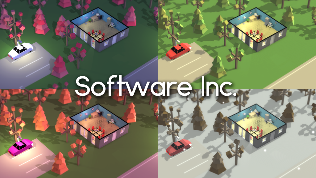
… Random banner!
Fifteenth update – Early access
As I’m writing this post, only the Windows version is available. The Linux version will hopefully be up before Monday and I will have a demo up for Linux as well. I will specifically be testing Software Inc. on a machine running Ubuntu 14. I’m not sure about the Mac version yet, it will be up as soon as I have a chance to test it. Naturally, you will have access to all versions as they become available if you buy it now.
Assuming Software Inc. gets through Greenlight(Browser link here –Steam link here), you will also get a Steam key.
Pricing
The game is currently 10$ and will be throughout the pre-alpha phase.
My plans are for it to be 12$ in alpha, 14$ about half-way through the alpha, 16$ during beta and finally 18$ at release, excluding any tax that may apply to your country. These prices may change at any point.
Early access
I’ve chosen to do early access because I don’t have a lot of money to sink in to this project. I really want it to have pretty character-models with cool animations, a pretty graphical user interface and proper quality assurance. All of these things are expensive and I’m already out around $2000. If I don’t raise enough funds for these things, I will still finish Software Inc. and you will still get a playable game in the end, but it probably won’t feel as nice as it could have. I won’t be cutting any features that I have planned, though!
Immediate future
I’m currently working on my bachelor thesis in a group of 3, which we will be defending in the beginning of April, so development will move slowly during these next couple of months.
I expect to release a playthrough/tutorial/devlog-thing at some point in the near future, so look forward to hearing my horrible accent and squeaky voice!
Semi-distant future
Other than my thesis, I have a job, which contractually takes priority, and I expect to have a job throughout the development of Software Inc.
Seeing as though I’m only one person right now, development might move a little slow, but I’m an effective programmer and I have been able to get Software Inc. to a playable and almost feature-complete state within 6 months without any help, while taking courses and working a job. So in any case, I expect it to take around 2 years to finish from now and unless something horrible happens, I will be finishing it!
Fourteenth update – Base mechanic overhauled
Click here to play the new demo.

Software Inc. has been featured in three articles this last month, you can read them here:
Indieroundup.com (Playthrough)
Nordicgamebits.com (Interview)
P911-magazine.com
(The last one is in French)
For this update, Software Inc. has had a base mechanic completely replaced.

Instead of the old Innovation/Stability/Usability sliders when designing software, a feature system has been added. Features control development time, Innovation, stability, usability, how many artists are needed and they can depend on features in various ways. 3D rendering can supersede 2D rendering, music can depend on whether the selected audio tool has a music editor and 8-bit audio can depend on whether ALL operating systems selected support it. All of these features and their dependencies are of course moddable in the full version, using simple XML files.
I hope this addition makes the design process feel more intuitive.
To make all this work I had to make a simple editor for it (Shown below). It is windows only, but I might release it when Software Inc. releases. In the end, I hope to enable editing mods directly in-game.

I also fixed up the building system, by having the furniture you’re currently building actually show while your placing it. And you can no longer build rooms in the middle of nowhere without support.

I updated the name generators with some new words, the results are great, with names such as:
- Foot Simulator of Death
- Spacewars in Space
- Baby Rebirth at night
- Horse Tycoon in Space
- Fish Manager Ultra
- Horse Killer At Night
The name generators are completely moddable and can be edited with plain text files.
You can see an always up-to-date list of all changes here: Changelog
Why isn’t Software Inc. out yet? My plan was to release the game at pretty much the same time as the Greenlight went live a month ago, but I’ve been let down by a third party. Basically, someone messed up two months ago and I’ve been paying for it. Hopefully, it will soon work out. I’m doing what I can, but I have limited time available to go around and fix stupid bureaucratic mistakes.
Finally, remember to vote for Software Inc. on Greenlight! You can open the Greenlight page in your browser by clicking here, or directly in steam by clicking here. Software Inc. is currently 48% of the way to the top 100.
Thirteenth update – Demo update
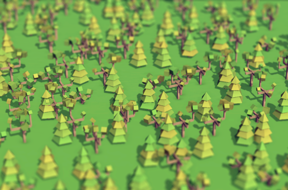
Firstly, I’ve added pine trees
It breaks up the terrain quite nicely. As with the old trees, they are procedurally generated, which basically means randomly rotated pyramids are stacked on top of each other.
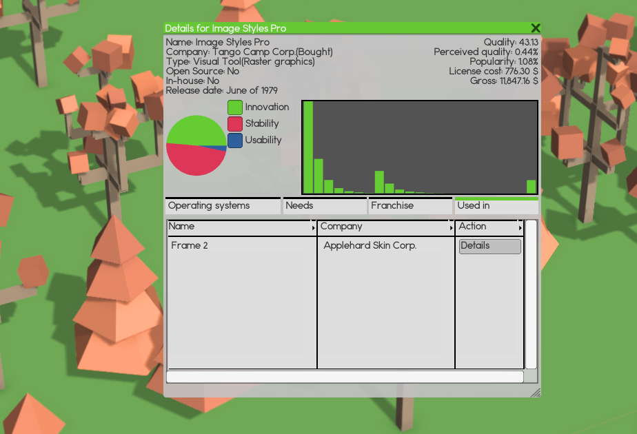
There is now a larger emphasis on licenses. Some of the product profits will come from other companies using them in their own products. This also prompted me add a window that presents more details on each product.
All employees now get abilities. Before, only leaders would level up, some abilities are therefore specific to an employee role.
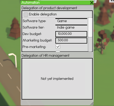
One of the abilities is for leaders to take over their own software production cycle. You can set some parameters for what kind of software should be developed, and the leader will make sure to delegate tasks to teams, which you’ve chosen. These teams will then develop and release the software, until you cancel it.
These features are not available in the demo.
Twelfth Update – Steam Greenlight
You can now vote for Software Inc. on Steam Greenlight!
Click here to open in Steam or here to open in your browser!
And I made a new teaser trailer, which you can watch right here. Please tell me what you think!
The early access release of Software Inc. is closing in, I’m currently waiting for an approval of my application for a bank account. Soon after, I will release the Windows and Linux version of Software Inc. I haven’t tested the Mac build yet, since I don’t own one, so I’m holding off on the Mac release for now.
I’ve been dealing with a lot of work not related to the actual game mechanics of Software Inc., so I’ve not been progressing directly towards the alpha release, but just polishing what I have. I can now begin finishing up the missing mechanics to officially promote Software Inc. to alpha, this will happen during these next two months.
During the alpha, I expect to implement all the game mechanics and add some more content. I will promote Software Inc. to beta once this is done. The alpha should last somewhere between a year to two years. The beta phase will consist of balancing, optimization, bug fixing and adding more content. I have no idea how long the beta phase will take, the important thing for me is that I release a finished and polished experience in the end.
So how do you know this is not just vaporware? I’m financing it myself for one. I have a job and I don’t want to risk the development of Software Inc., my first official game, on early-access or Kickstarter funding that might not happen. I’m committed to finishing this game, and I will do that in my apartment, on my own, with my own money, if I have to. I’m not going to run out of money because I rented an office space or hired too many people. The reason I’m releasing Software Inc. in early access is because I want to spend money on making Software Inc. better than what I can by myself and with my limited financial resources.
I will do a video blog during this month to demonstrate the game in action and talk a bit about the mechanics. As always, you can find the web demo here.
Eleventh update – Visual upgrade
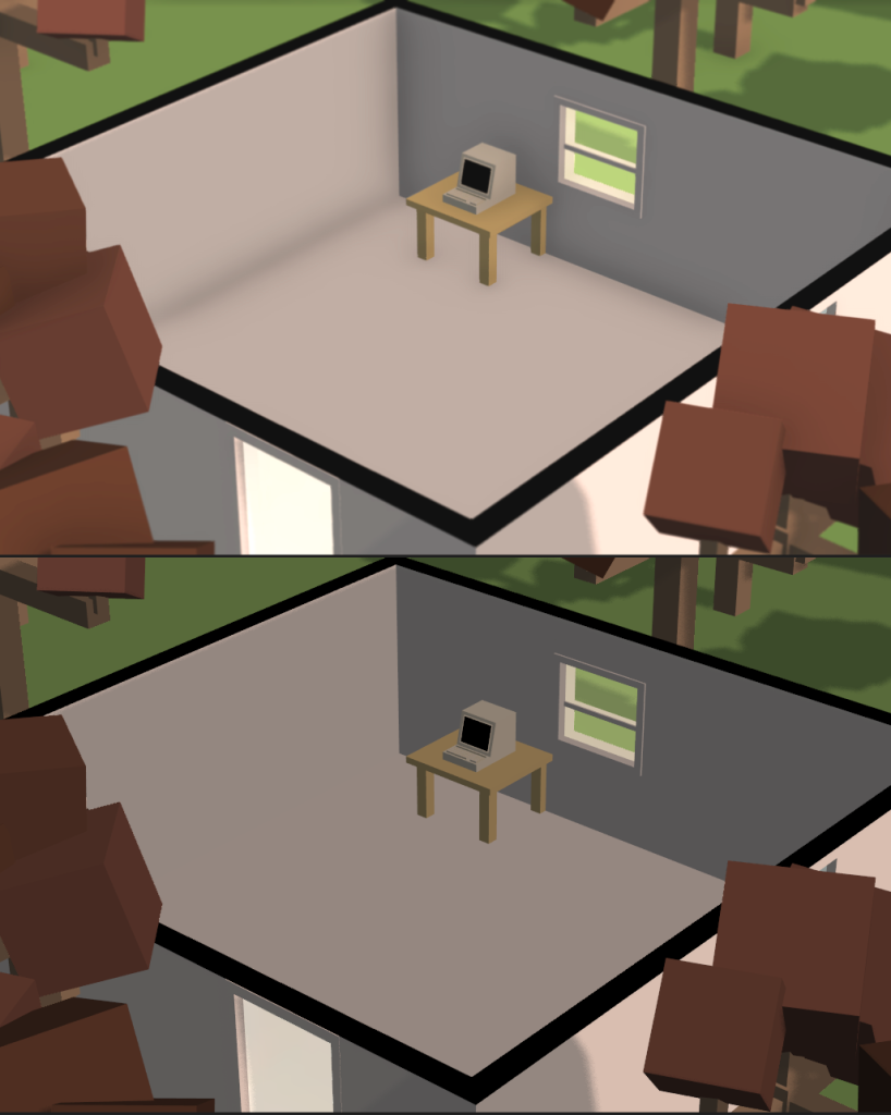
This week I shelled out for Unity Pro so I could get my hands on those sweet post effects and boost my optimization efforts using the profiler.
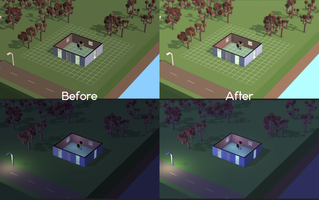
The process of adding color correction was pretty cool. You use a texture(link to a contrast enhance from Unity’s manual), overlay the texture on some pictures of your game, play around with the levels and saturation in your favorite photo editor and, finally, import the resulting texture back into Unity, so it can see how you altered the colors.
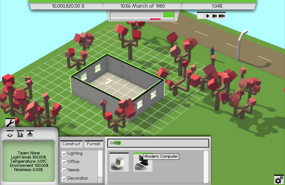
I also began reworking the user interface using Unity’s new Canvas system. It took me about 11 days to re-create all 22 windows in the game, but now most of the windows are resizeable, which is a big plus. On top of this, I completely overhauled the bottom area of the HUD, all buttons are now grouped and you can search for furniture to build, Sims-style.
In addition, I added a temperature system, which requires you to build heating and ventilation to regulate room temperature and added some cool data overlays, so you can get a quick overview of the state of each room in your office building.
Insurance policies are also implemented and coming up in the next update, which completely changes the hiring mechanics. More on this later.
Finally, I’m on track to release the alpha build soon, there are still two to three subsequent pre-alpha releases, you can follow the progress on Trello. I’m currently waiting for an approval of my application for a bank account for my company, Coredumping. When I have a place to put money, I will start selling the full game and, if it still exists, start a Greenlight campaign. I expect this to happen sometime in the next couple of months.
As always, the demo is available here.
Tenth update – New character model (again again again again)
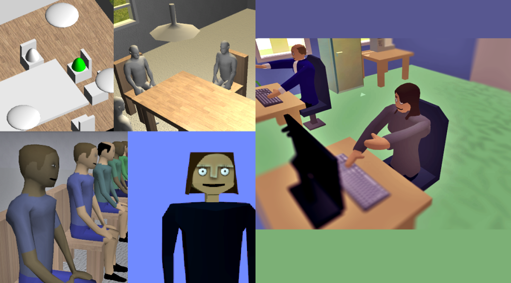
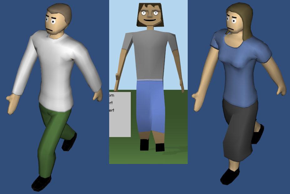
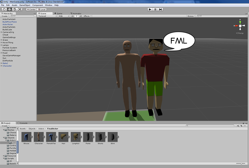
I started with a sphere, I then downloaded a model from here to test animation, I then made my own to avoid copyright issues. I hated it, so my wife drew some concept art for a new one, which I screwed up modellin. I’ve just modeled the latest one, to the right in the picture above.
It will most likely get replaced again, if I can afford it, but the important thing is the underlying system.
The plan with character customization in Software Inc. has always been to have a simple model and change the textures. This has worked pretty badly, especially for hair, I ended up having a mesh for each gender, and the female mesh had hair and skirt permanently attached. But reading an update from Parkitect, I got inspired. I wanted to try implementing the same system, i.e. separate meshes for the lower part, the top part and the head.
I started testing how to control two meshes using one skeleton. I made one parent skeleton, containing all animations, but no polygons. Each mesh I added to the final mesh then made its bones children of the parent skeleton’s equivalent bones, forcing them to animate. This worked perfectly. And the script is simple: Foreach of my bones, set the parent transformation to a bone in the parent skeleton, which has the same name, and reset position and orientation. It is very important to always use the same base skeleton when rigging each sub-part though, the transformations need to be identical.
After some trial and error, I figured the best way to go about this, was to have a base human mesh, which is unisex, and then stick clothes to its skeleton. This works really well, as you can see in the first draft, in the picture above. (Please disregard the fact that I am obviously an amateur 3D-modeler)
I then proceeded to rewrite all customization code. It wasn’t that hard, since after adding the “add clothes mesh to my skeleton” functionality, I just had to replace “Texture” with “Mesh” here and there. Sadly, the previous model has now been replaced, just as the demo has been released (you can try the demo here), so it never really saw the light of day.

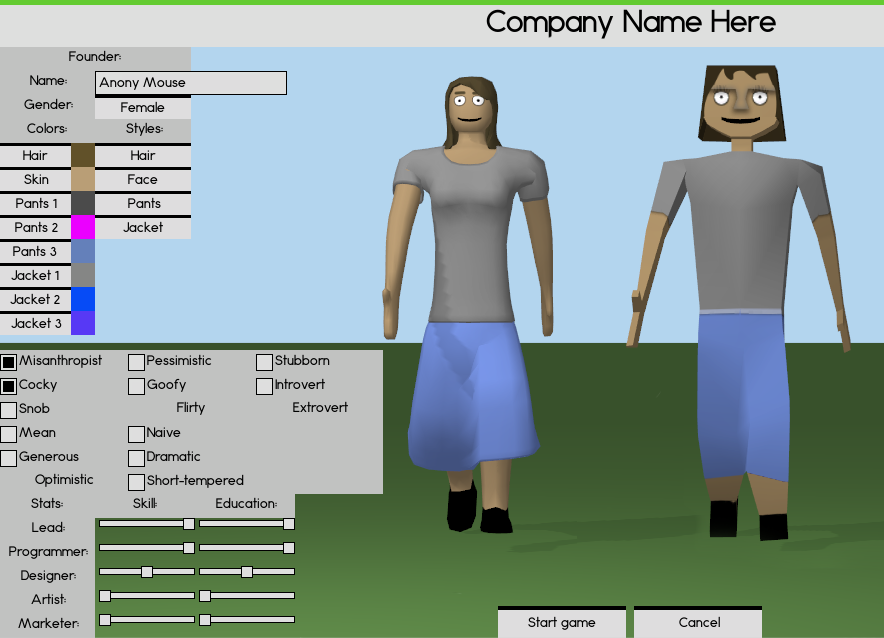
You can see a comparison of an old screenshot of the customization screen and then recreated with the new model in the picture above.
Ninth Update – Before and after
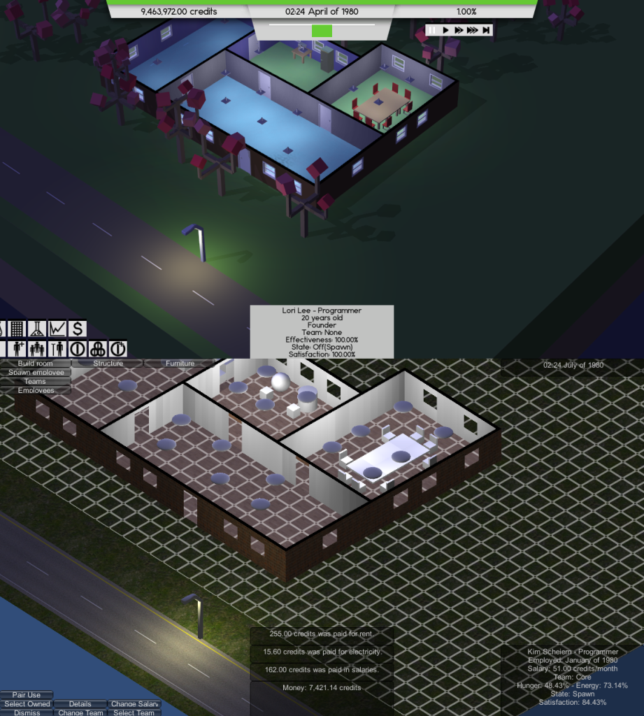
I wanted to do a comparison of my game from when I started developing Software Inc., around the 4th of June, and now, in October. Sadly, I’ve only begun using source control recently, so I couldn’t go back to an old version, I had to manually replicate old screenshots.
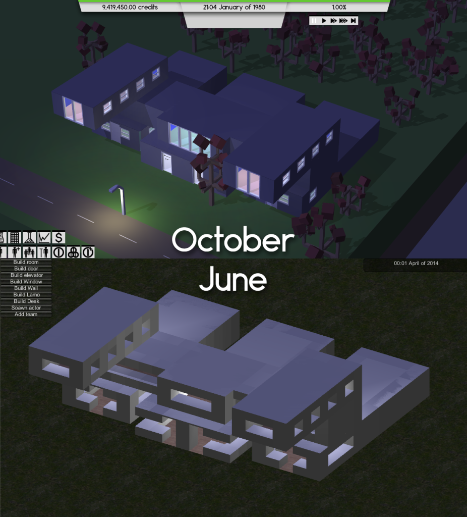
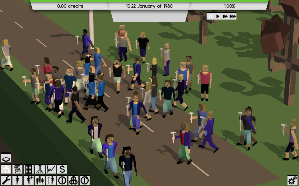
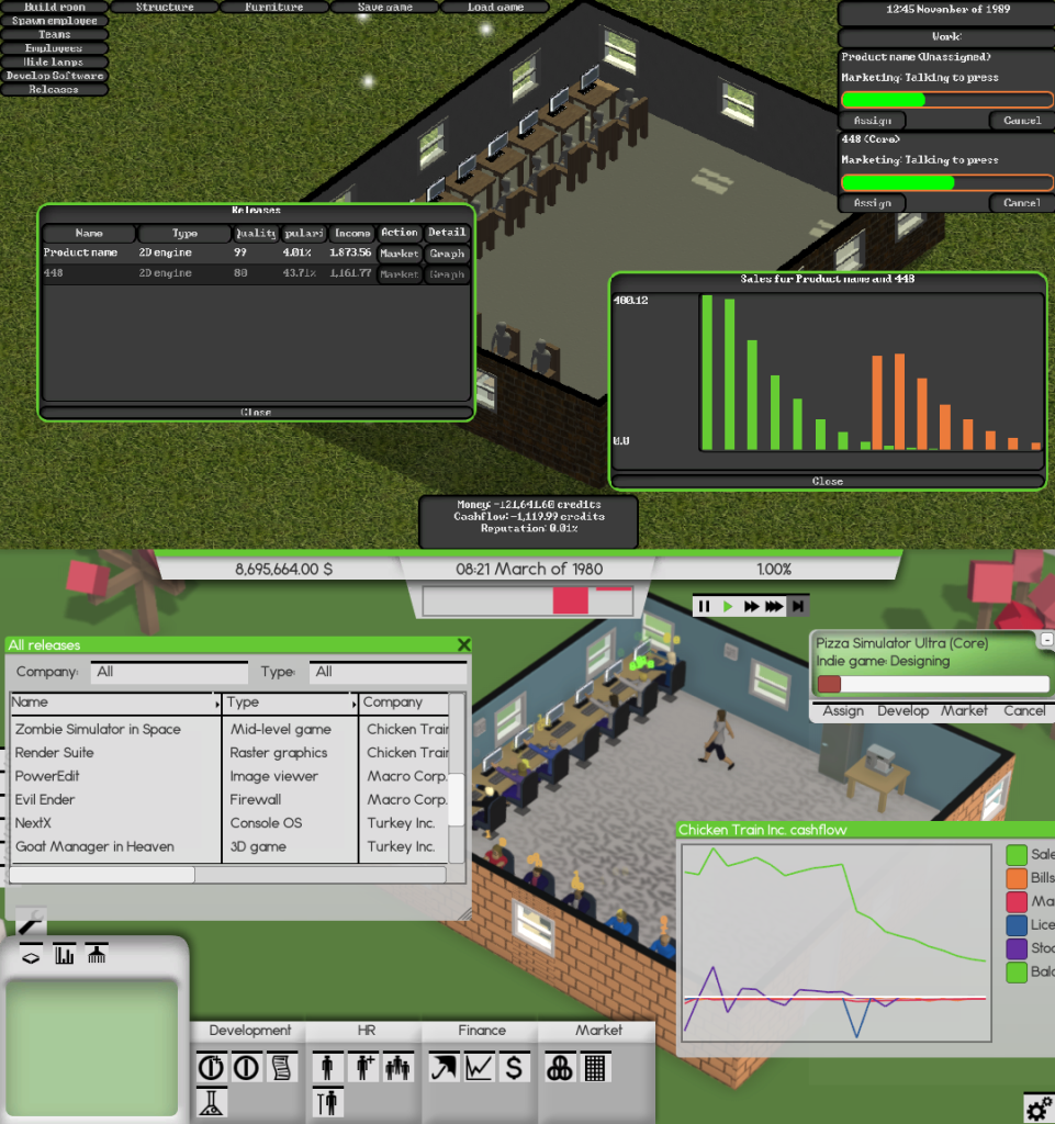
This is the second ever screenshot I took of the game. I started off just making the building mechanics. In the beginning each unit of wall was completely square, took up an entire cell in the grid and worked like in Prison Architect. Now, walls are thin and sit at the edges of the grid, like in the Sims. You get much more space out of a room, since you can build stuff where the walls used to be.
It is really obvious in this picture from June that walls are placed in the center of the grid rather than at the edges.
All the programmer art has been replaced and the style has gone from an ugly stab at realism to smooth minimalism. I went for minimalism since I wanted the game to have depth in its simulation of the market. Having loads of detailed textures and bump maps would only clutter the screen, which is already full of windows, information and buildings spanning multiple floors. With the minimalist style, I believe its easier to get an overview of the offices. Another reason was that I am not a professional 3D-modeler, making everything flat shaded and simple made it easier on myself.
It is not visible in this picture, but the “255.0 credits was paid for rent”, etc. messages that take up a lot of space in the bottom of the June picture has been replaced with a Dungeon Keeper style message system. I’m really tempted to add a *clink* sound when new messages arrive.
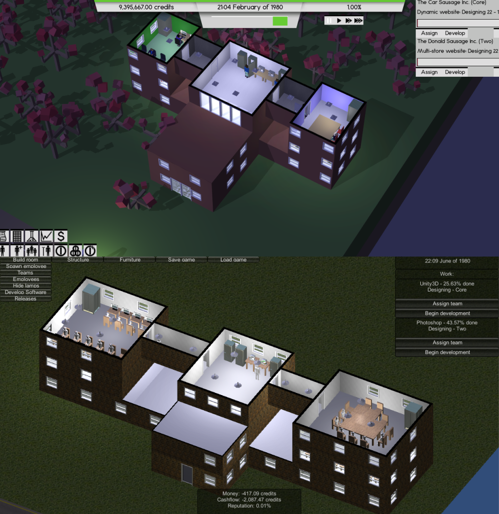
The last try at replicating an old screenshot didn’t go as well, the measurements are really off, but it gets the point across, I think. You can see work items in the top right corner, these describe things that are being worked on in your company. I’ve given them a bit of an overhaul from their clunky Unity look, they can now be collapsed and pinned to rooms.
On a final note, I’ve almost finished founding my company, Coredumping, and I will be releasing a web demo of Software Inc. at the end of this month.
