Tenth update – New character model (again again again again)

Screen17M4

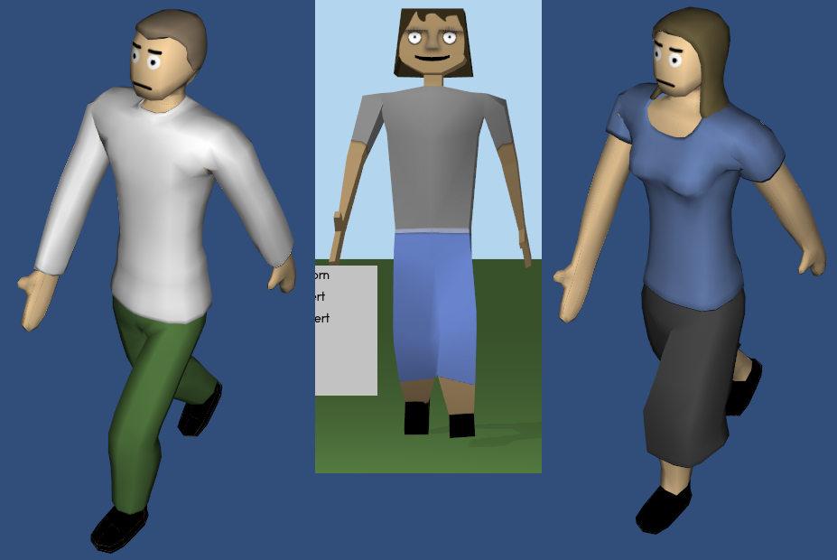
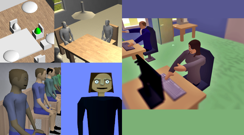
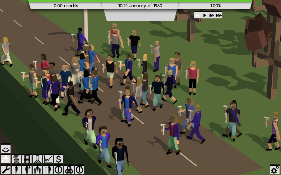
I started with a sphere, I then downloaded a model from here to test animation, I then made my own to avoid copyright issues. I hated it, so my wife drew some concept art for a new one, which I screwed up modellin. I’ve just modeled the latest one, to the right in the picture above.

It will most likely get replaced again, if I can afford it, but the important thing is the underlying system.

Screen12M4

The plan with character customization in Software Inc. has always been to have a simple model and change the textures. This has worked pretty badly, especially for hair, I ended up having a mesh for each gender, and the female mesh had hair and skirt permanently attached. But reading an update from Parkitect, I got inspired. I wanted to try implementing the same system, i.e. separate meshes for the lower part, the top part and the head.

Screen10M4

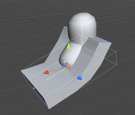
I started testing how to control two meshes using one skeleton. I made one parent skeleton, containing all animations, but no polygons. Each mesh I added to the final mesh then made its bones children of the parent skeleton’s equivalent bones, forcing them to animate. This worked perfectly. And the script is simple: Foreach of my bones, set the parent transformation to a bone in the parent skeleton, which has the same name, and reset position and orientation. It is very important to always use the same base skeleton when rigging each sub-part though, the transformations need to be identical.

Screen13M4

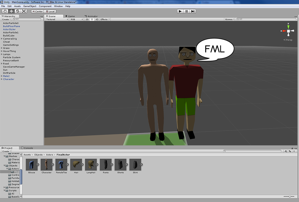
After some trial and error, I figured the best way to go about this, was to have a base human mesh, which is unisex, and then stick clothes to its skeleton. This works really well, as you can see in the first draft, in the picture above. (Please disregard the fact that I am obviously an amateur 3D-modeler)

Screen14M4

I then proceeded to rewrite all customization code. It wasn’t that hard, since after adding the “add clothes mesh to my skeleton” functionality, I just had to replace “Texture” with “Mesh” here and there. Sadly, the previous model has now been replaced, just as the demo has been released (you can try the demo here), so it never really saw the light of day.

Screen15M4

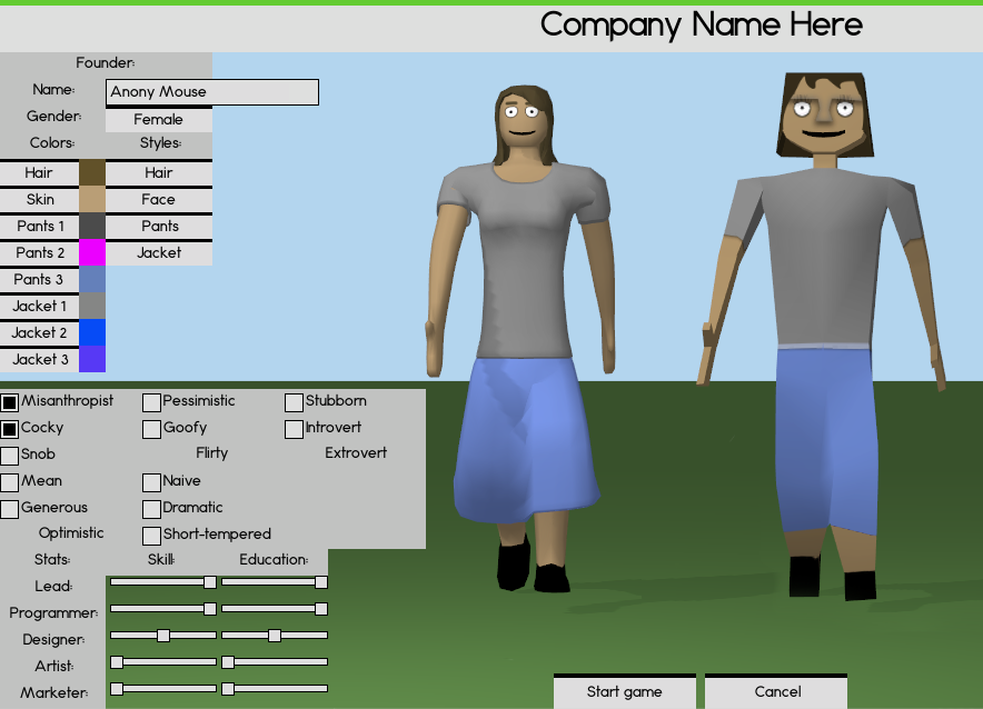
You can see a comparison of an old screenshot of the customization screen and then recreated with the new model in the picture above.
Ninth Update – Before and after

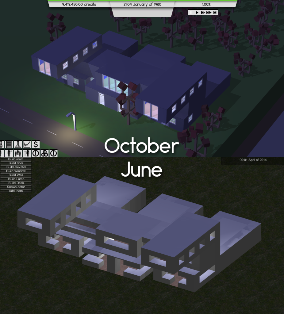
I wanted to do a comparison of my game from when I started developing Software Inc., around the 4th of June, and now, in October. Sadly, I’ve only begun using source control recently, so I couldn’t go back to an old version, I had to manually replicate old screenshots.
Comp1
This is the second ever screenshot I took of the game. I started off just making the building mechanics. In the beginning each unit of wall was completely square, took up an entire cell in the grid and worked like in Prison Architect. Now, walls are thin and sit at the edges of the grid, like in the Sims. You get much more space out of a room, since you can build stuff where the walls used to be.

Comp2
It is really obvious in this picture from June that walls are placed in the center of the grid rather than at the edges.

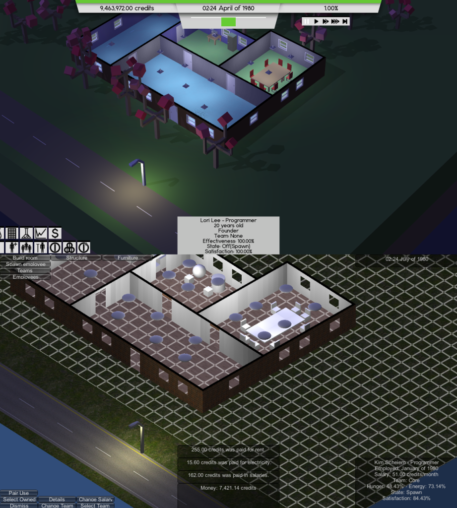
All the programmer art has been replaced and the style has gone from an ugly stab at realism to smooth minimalism. I went for minimalism since I wanted the game to have depth in its simulation of the market. Having loads of detailed textures and bump maps would only clutter the screen, which is already full of windows, information and buildings spanning multiple floors. With the minimalist style, I believe its easier to get an overview of the offices. Another reason was that I am not a professional 3D-modeler, making everything flat shaded and simple made it easier on myself.

It is not visible in this picture, but the “255.0 credits was paid for rent”, etc. messages that take up a lot of space in the bottom of the June picture has been replaced with a Dungeon Keeper style message system. I’m really tempted to add a *clink* sound when new messages arrive.

Comp3
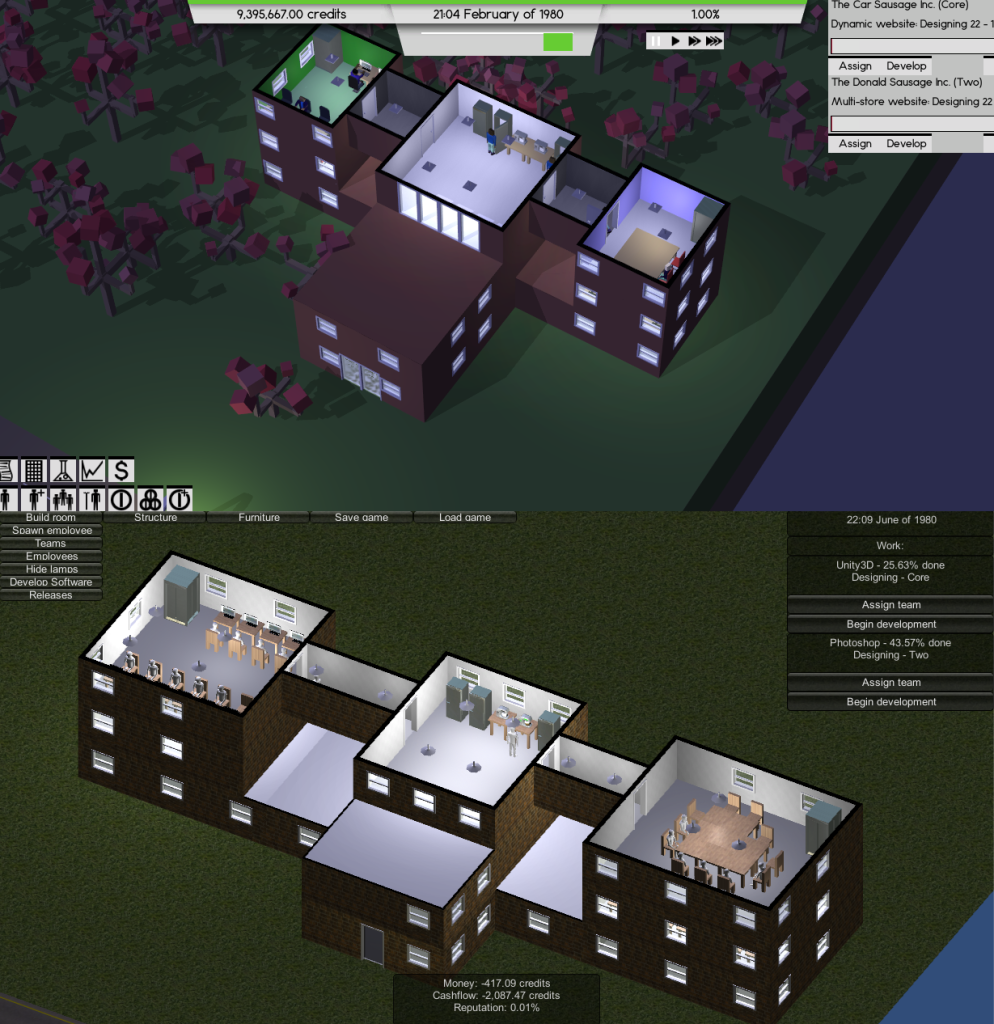
The last try at replicating an old screenshot didn’t go as well, the measurements are really off, but it gets the point across, I think. You can see work items in the top right corner, these describe things that are being worked on in your company. I’ve given them a bit of an overhaul from their clunky Unity look, they can now be collapsed and pinned to rooms.

On a final note, I’ve almost finished founding my company, Coredumping, and I will be releasing a web demo of Software Inc. at the end of this month.

Eighth Update – Personalities

I’ve just finished implementing the personality system in Software Inc! The personality system is a graph of personality traits, describing their relationship with each other and their attributes. Each employee in the game gets two personality traits.

The graph is of course moddable, so you can add traits and decide their attributes and relations.

Screen7M4

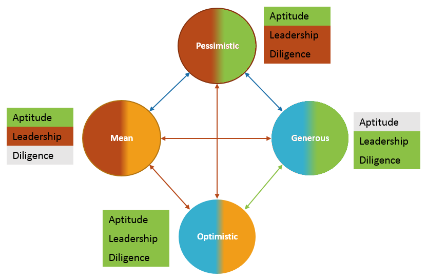
I’ve illustrated a tiny piece of the current graph in the image above. The circles are personality traits, the color of the arrows between them indicate how they regard each other, the colors of the rows in table next to the circles illustrate how a trait influences the employee and the color of the circles indicate their compatibility.

As an example, say you have the mean trait, then you will have aptitude, bad leadership skills and average diligence. Being mean also makes you dislike people who are generous and optimistic, and feel indifferent towards people who are pessimistic. Finally, if you are mean you can also be pessimistic or optimistic, but you can’t also be generous, since the mean circle isn’t blue or green. Note that this is not necessarily how it works in the real world, but the point is to give the player an intuitive sense of an employee based on her personality traits and these relationships are subject to change.

Screen6M4
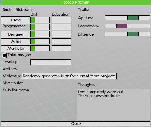
This is how the employee detail screen currently looks. The personality traits are written in the top left corner.

So what difference does having personality traits make? When you put an employee on a team, her traits will be weighted against the other members of the team, determining how well she works together with the other members. If she dislikes a person on her team she might get angry and want to quit. Overall bad team compatibility will have an effect on your employees’ work quality, but a good team leader can alleviate the problem.

So what does aptitude, leadership and diligence mean? Well, each personality trait changes the characteristics of its employee, which affects their stats and behavior in the game. Currently aptitude, leadership and diligence are the only three characteristics, but the system allows me to expand these at any point, although they are not moddable. Aptitude controls how quickly an employee gains skills and education, leadership controls how well a leader does his job(research, employee satisfaction, etc.) and diligence controls how late an employee is and how often the employee calls in sick.

Development Progress So Far

Screen1M4

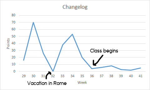
So this is how progress looks so far on Software Inc. There are huge spikes and rapid drops. The big spike in the beginning was due to a week where I had no obligations, it makes me wonder how quickly I would be able to finish this game if this was a full-time job. Probably less than a year, I’m sure.

I had a quick trip to Italy with my wife and didn’t bring a laptop with me, so that explains the first drop. Currently, I’m earning my bachelor degree in Computer Science and I will be done around May next year. I also work a part-time job at a pension company, but my job has had little to no impact on the amount of work I can get done, but my classes are draining me completely. I only have a couple of courses left and my thesis, but I’m just not motivated to finish it. It feels like I’ve finished all the interesting courses and now I’m just doing it to have something on my resume. So work on Software Inc. will be a little slow for the next six months, in between holidays. I’ll scramble to get it polished before the demo I have planned this month.

Screen2M4

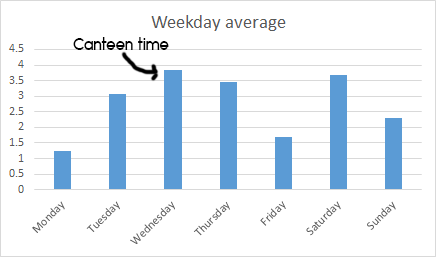
Here is one thing that surprised me, though; during the current slow period the average amount of work I complete on Wednesdays has kept pretty steady compared to the other days. On Wednesdays I have 4 hours of waiting for the next class to begin, so I sit in a canteen and try to get a little work done on Software Inc. and it has proved extremely valuable. Which just goes to show that a little work on a regular basis can have a huge impact, although it doesn’t feel as significant as the big sprints, but the sprints have probably helped in keeping the Wednesday-average high to begin with.